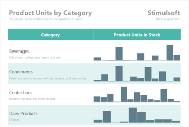
Sparklines can now be used as a data visualization component in reports.
Features
- Sparklines in reports - In this release Sparklines can now be used as a data visualization component in reports. You can add a component to a report page or a Data band, specify a data column, and select a type. Data values can be displayed as Line, Area, Column, or Win/Loss.
- Viewing data for elements - Now you can view data from the current dashboard element directly in the viewer.
- Viewing a dashboard query - When designing a dashboard using multiple data sources, you can view a virtual data table of the current dashboard.
- Support for GIS - Added the ability to display geometric primitives according to SQL standards on the Online Map element.
- Gauge settings - Now value labels in the Gauge element can be positioned both outside the value scale and inside. Also, value labels can be disabled.
- Updated Interaction editor - Improved the Interaction editor used for designing reports.
- Show Blanks - Added the ability to show or hide empty values in the list of values of the current filtering element.
- Sort by variation - In the 2020.4.1 release, you can sort the indicator and progress values by the deviation value.
- Icons in charts - You can now use icons in report charts, to display the graphical objects, in the label, and the chart legend.